Makeover Monday 2019/W34 - On the relationship of U.S. teens and parents with their phones
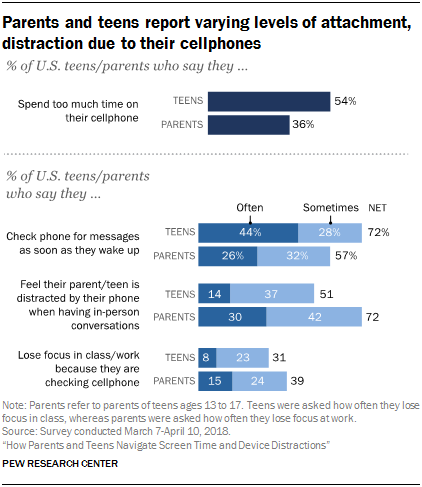
The dataset for this week was exceptionally tiny and offered by the Pew Research Center. It contained the answers to 4 questions asked to U.S. parents and teens regarding their relationship with their phone. The original visualisation is pretty straightforward, as one would expect considering the small size of the dataset: it simply uses a series of horizontal, sometimes stacked bar charts to display the proportion of teens and parents who responded in a certain way, with a monochromatic blue palette.

My thoughts on the visualisation:
What works with this chart?
- It uses a simple visualisation for a simple point, making the take-home message easy enough to understand;
- The scales of the three bottom graphs are consistent with each other, allowing a quick comparison of the different answers of teens and parents to the various questions;
- It works well as a standalone, as it can be understood with no additional context or explanations.
What doesn’t work with this chart?
- It is very text-heavy for a chart that only covers a few data points. A lot of it is simply redundant, for example: in “% of U.S. teens/parents”, both the percentage and the participant labels are also included in the graphs themselves, and could be omitted or conveyed with alternative methods;
- The monochromatic colour palette makes the graph cohesive but not very interesting to look at. Different colours could have been used to differentiate teens from parents as well as the frequency answers;
- The lack of the rest of the frequency labels apart from “often” and “sometimes” is a bit confusing, and the dataset could benefit from including the rest of the answers, even if just for completion;
- The “NET” label is uselessly complicated, and could be substituted by a “TOTAL” or even removed altogether.
How can it be improved?
- The data cannot be visualised in many ways other than with bars. However, while the last three questions benefit from being plotted on a chart due to the different categories of answers, the first question only corresponds to two percentages, one for the teens and one for the parents. Therefore, to differentiate this question from the others, I made the bars into two number boxes, colour coded based on the group;
- Using the two colour-coded percentages and the description underneath them, I tried to implicitly create two columns on the chart, one on the left for the teens, and one on the right for the parents. The chart colours also indicate this of course, but I prioritised the coherent positioning to include colourblind viewers. This also allowed me to get rid of the redundant “teen/parent” labels;
- I made the questions direct to try and engage with the viewer, who will hopefully try to answer those questions and as a result compare their experience with that of the people surveyed;
- Finally, I researched and added the amount of people interviewed for this study. I realised, while preparing the visualisation, that this information was nowhere to be found on the original vis, and I had to dig quite a bit in the original report to find the numbers. I find that the sample size should be a lot more visible in all visualisations for which this is applicable, as it helps the viewer determine how representative the results they are looking at might be.

Interactive dashboard
How did I do it?
There is nothing fancy going on with the visualisation this week, as the data was small enough to be represented fully without any need for filters or parameters. I did try, at first, to engage the viewer by making them respond to the questions and using their response as a filter, but due to the lack of the rest of the labels, the result felt dull and incomplete.
Interestingly enough, this chart took me almost the entire day, in part because I decided to rework it almost completely twice, but mostly because I couldn’t seem to format the dashboard so that I could specify the height in pixel of each box. As a result, I had to resize everything manually to ensure some symmetry and consistency, which took a long while. Hopefully I will figure out what I was doing wrong next time.
Final thoughts
As much as I would have preferred to work with a larger dataset, I understand how important it is to practise with very small ones as well, as often one just has to make do with what they’re given - and I appreciated the challenge very much. Like I mentioned last week, I did try to make the chart a standalone by including a short explanatory paragraph at the beginning, and a source and signature at the end, and I am going to try and do it every time now. However, for some reason I still cannot seem to wrap my head around changing the background colour to something other than white. Some experimentation, and possibly some colour theory study, is on order.
