Makeover Monday 2019/W36 - Each age has its season - or almost!
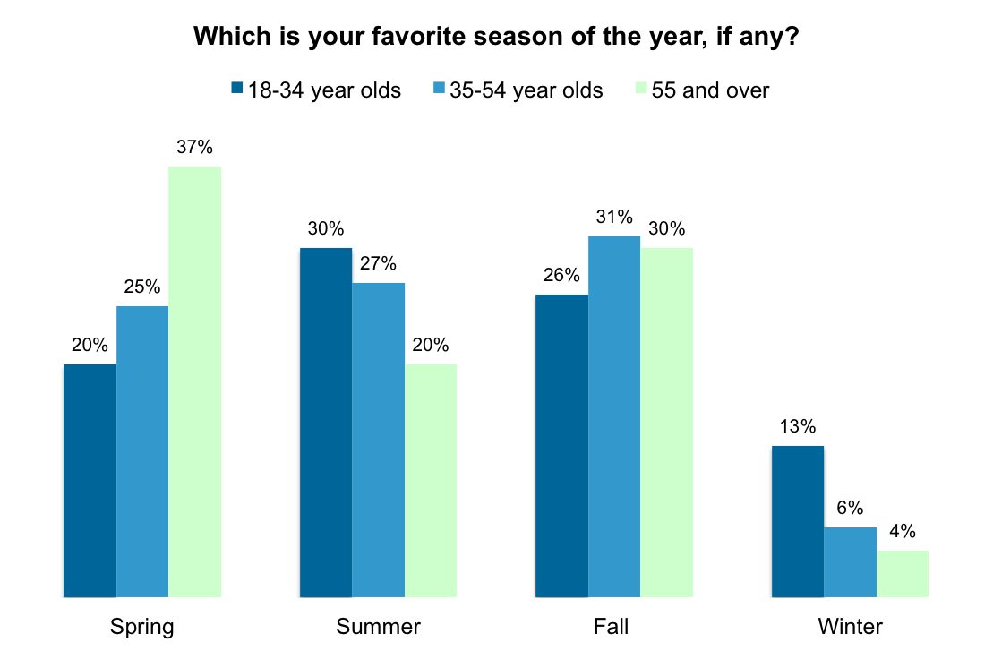
This week’s dataset was small and to the point, tackling the issue of which season is the favourite of different age ranges of Americans. With autumn about to begin - which people are notoriously crazy about, especially on the internet - the data feels light-hearted and relevant, if not a little dated, being from 2013. The chart that represents the data in question is the following:
My thoughts on the visualisation:
What works with this chart?
- It is direct and clear, separating the preferences of the three age groups based on the season in question;
- It uses the title to implicitly explain why the percentages do not add up to 100%, since the question ends with “if any?”, meaning people had the option to not declare a preference;
- It is overall simple and easy to understand at a glance.
What doesn’t work with this chart?
- There is very little context: if we were to look at this visualisation only, we wouldn’t know when the survey was conducted, on how many people, or by whom;
- The very light colour chosen for ages 55 and over might be too light to be clearly distinguishable from the background on some screens.
How can it be improved?
- While I do not feel the makeover I produced this week improves a lot on the original visualisation, I did not have a lot of brain space to make something less derivative, and in all honestly I did not think it necessary either: the dataset is very simple, and trying too hard to make a fancy visualisation from simple data can often end up needlessly complicating it;
- Therefore, I kept the main structure of the visualisation, grouping the bars by season first and then by age, only I tried to make it more visually interesting by colouring the seasons differently and making it a lollipop chart instead of a bar chart - the main reason being that I had never made one in Tableau, and now I know how to do it! (See next section)
- Furthermore, I tried to make up for the lack of context by adding a small introductory paragraph with the source of the information and the year it was acquired, as well as a little comprehension aid, highlighting which group preferred which seasons above the chart.

Interactive dashboard
How did I do it?
As I said before, there is not much fanciness going on with this visualisation, mostly because the data does not need it, partly because it has been a very busy week and the important thing is showing up. However, I did learn how to make lollipop charts, which can be done by creating a double axis plot, synchronising the axes and selecting bars as the shape for one side of the plot, and circles (or whatever you want at the top of the bar) for the other! Follow this link for a cool tutorial on when and how to make a lollipop chart in Tableau.
Final thoughts
“Finished, not perfect” has been the mantra I have been trying to adopt for a few years now, and this week I had to pick it up and dust it again and put it on top of my pride. I am sure I could have done something fancier was I not in the last week of my summer before my MSc begins, but I am not sure this data even needs it. It is simple, it is straightforward, and most importantly, it is done, and I wish you all a great end of the week! I hope to make it to next week alive, and I will definitely try to participate between a lecture and another!